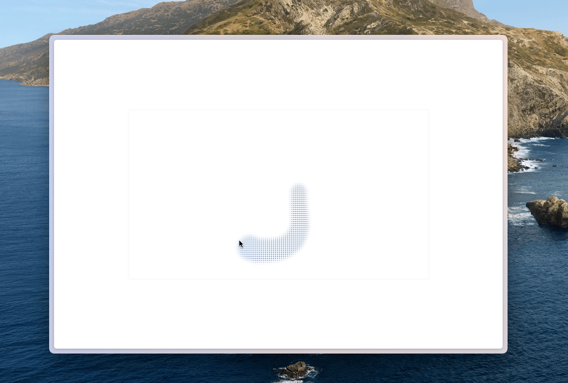
之前在很多地方都有看到一个有趣的组件,这个组件在底部没有东西的情况下看起来就像是一个完整的纯色面板,但当该面板下方有物体经过的时候这个面板的庐山真面目就会显现,物体经过面板的对应位置会出现一个个小孔透出这个物体的对应颜色。
经过观察这些网页的页面的组件可以知道其实最主要的实现是通过下面这个 CSS
css
backdrop-filter: saturate(50%) blur(4px);
background-image: radial-gradient(transparent 1px, #fff 1px);
background-size: 4px 4px;
blackdrop-filter 主要就是实现背景的模糊可以是的颜色润开,使得呈现在小孔里面的颜色更加的有层次感 background-image 实现在 Div 上的一个个小孔的样式, transparent 为每一个小孔可以让面板下方的颜色透出,#fff 为面板的颜色 background-size 定义每一个小孔整体的大小并重复覆盖整个面板
具体代码如下:
vue
<template>
  <div class="w-screen h-screen overflow-hidden">
    <div
      class="top-1/2 left-1/2 -translate-x-[50%] -translate-y-[50%] w-2/3 border-gray-50
             rounded-md border-3 border-solid shadow-black fixed z-20 bg-img-dot aspect-video"
    />
    <div
      class="rounded-full -translate-x-[50%] -translate-y-[50%] bg-blue-500 fixed z-10"
      v-for="(item, index) of moveList"
      :style="{
        top: `${item[1]}px`,
        left: `${item[0]}px`,
        width: `${50 - index}px`,
        height: `${50 - index}px`,
      }"
    ></div>
  </div>
</template>

<script setup>
import { useMouse } from "@vueuse/core";
import { ref, watch } from "vue";

const moveList = ref([]);

const { x, y } = useMouse();

watch([x, y], (newValue) => {
  moveList.value = [newValue, ...moveList.value].slice(0, 20);
});
</script>

<style scoped>
.bg-img-dot {
  backdrop-filter: saturate(50%) blur(4px);
  background-image: radial-gradient(transparent 1px, #fff 1px);
  background-size: 4px 4px;
}
</style>